Attribute fields#
Attribute fields are the form elements in the Web GUI of i-doit, through which you read and edit attributes. This article presents all available field types.
Overview#
Each editable attribute is represented by a form field -- both in standard categories and in custom categories. Almost every attribute field can be declared as a mandatory field and/or provided with validation options.
Non-editable attributes either do not appear in the edit view at all or appear as read-only fields.
Example: Dynamically calculated attribute -- The FQDN in the Host address category is automatically composed of the Hostname and DNS Domain attributes and therefore has no input field of its own.

Example: Read-only field -- The Object ID is automatically generated by MySQL/MariaDB and cannot be edited.

Single-line text fields#
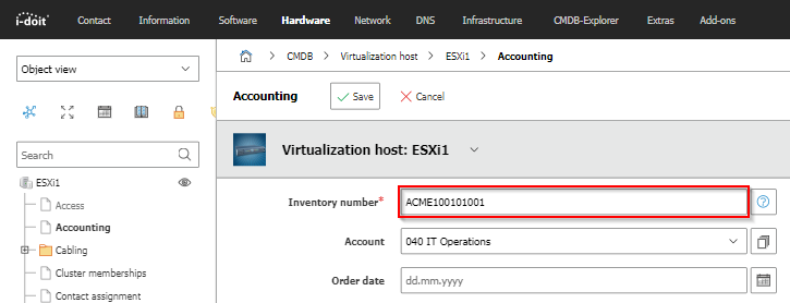
Single-line text fields accept any text with a maximum of approximately 255 characters. Example: the Serial number in the Model category.

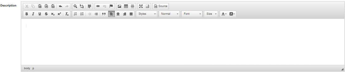
HTML editor / Multi-line text fields#
Multi-line text fields accept any text with a maximum of approximately 65,000 characters. You can optionally convert them into an HTML editor (WYSIWYG -- "What You See Is What You Get") to format text.
To activate the HTML editor:
- Enable WYSIWYG: Administration → [Tenant name] Administration → Settings for [Tenant name] → CMDB → WYSIWYG Editor in categories
- Advanced formatting options: Administration → [Tenant name] Administration → Settings for [Tenant name] → CMDB → Enable all WYSIWYG Editor features
Almost every category entry contains a Description attribute at the end, which is displayed as an HTML editor by default.
Dialog field (drop-down)#
The dialog field is a selection field (drop-down) with predefined values that you generally cannot edit. If you do not want to select a value, choose -- if available -- the simple dash (-).
Example: the condition in the General category.

An example of an attribute that can be centrally edited is the CMDB status in the General category.
Dialog-Plus field (extended drop-down)#
The Dialog-Plus field works like a dialog field, but additionally allows you to add your own values. You can do this either via the icon to the right of the attribute field or via the Dialog-Admin.
Examples are the attributes Category and Purpose in the General category.

When you click the icon, the list browser opens, where you can add new values and edit existing ones.
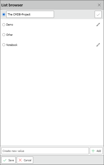
Note
Deletion is only possible via the Dialog-Admin. This function should be used exclusively by administrators, as removed field values are irrevocably deleted from all entries.
Multi-Dialog-Plus field (multiple selection)#
The previous selection fields only allow the selection of a single value. The Multi-Dialog-Plus field allows you to simultaneously select multiple values from a drop-down menu. In some cases, additional buttons are available for (de)selecting all values or reversing the selection.
As an example, the attribute DNS Domain in the Host address category is used.

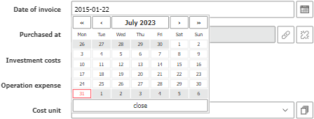
Date field#
The date field is used for entering dates. Click on the text field to open a calendar and select the desired date. Alternatively, enter the date manually in the format dd.mm.yyyy.
In the Accounting category, there is the example attribute Delivery date.
Units and intervals#
Some attribute fields are supplemented by an additional drop-down field that lets you specify the unit or interval -- e.g. time units, measurement units, weight units or time periods.
The attribute Warranty period in the Accounting category is an example.

Costs#
Costs are entered as decimal numbers -- both period and comma are allowed as decimal separators. The field displays the configured currency. You set this under Administration → [Tenant name] Administration → General settings → Currency format.
The attribute Investment costs in the Accounting category is an example.

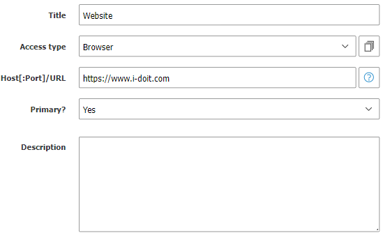
Link#
Some single-line text fields are intended for entering URIs. i-doit generates a clickable link from them.
The Access category provides this attribute field, for example.
Object relationships#
To establish relationships between objects, the object browser and special browsers are available. The text field is supplemented by two icons:
- Magnifying glass icon: Opens the appropriate browser for selection
- Bracket icon with lock symbol: Dissolves existing or selected relationships
For 1-to-1 relationships, you can type directly into the text field -- i-doit already makes suggestions as you type. For 1-to-n relationships, the text field is read-only and you select via the browser.

Object browser#
The object browser adapts to the respective relationship type -- not all functions described here are always available. Often the selection of filters is limited because only objects of certain object types are allowed.
If the selection of the referenced object is done via radio buttons, only a single selection is possible. However, if the  buttons are available, a multiple selection is possible.
In the upper area there are several tabs:
- Object view: The object view is sorted by filters. If the matching object is missing, it can be created via the Create new object button. Filters:
- by object type: First the object type is selected, then the object(s).
- by object group: If the Object group object type is used, objects can be listed per Object group.
- by person groups: All Persons per Person group are listed.
- by relationships: All relationship objects are listed, whereby the relationship type must first be selected.
- by date: Objects are sorted by date. The options are: recently created, recently modified, created this month, created last month.
- Location view: The location tree with all paths is built, from which the matching object can be selected.
- Search: Objects are searched by object title.
- Reports: Objects are listed based on previously created reports.
- Selected objects: This tab shows all already selected objects. Via the Create new object group from selection button, an object of type Object group is created and populated with the selection of objects.
The log lists all current changes.
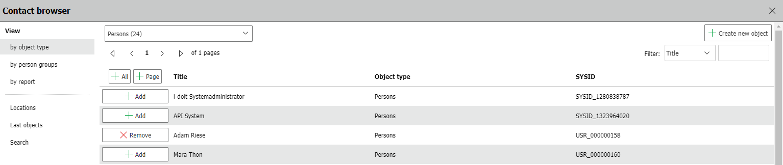
As an example, the Contact browser, which is available in the Accounting category for the attribute Purchased from, is used.

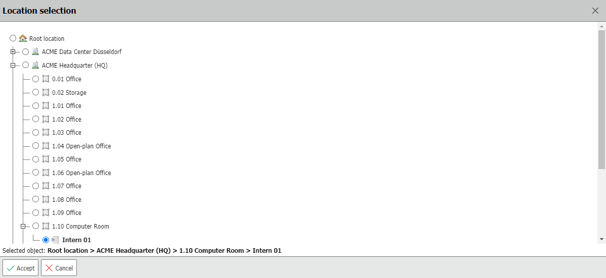
Location selection#
This browser builds a 1-to-1 relationship of type Location to an object defined as a location. When clicking the magnifying glass icon, the Location selection is presented, which is similar to the Location view (see above). This browser appears in the Location category.
Browser with sub-selection#
In some cases, it is necessary to select not only the object but also an attribute of that object. Examples are the attribute Connected to in the Port (Network) category, where an input or output from the Connector (Cabling) category is selected, and the option in the Service components category to select software relationships.
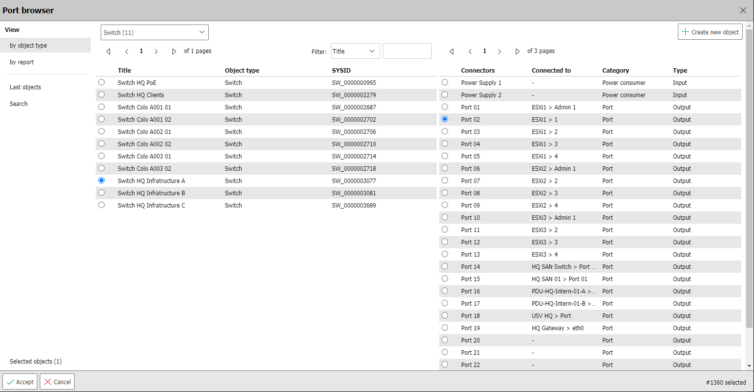
Note
When the browser is split into two sections, i.e. has such a sub-selection, and uses radio buttons, a selection must be made in both columns. For example, when cabling two devices, if only the connected object is selected in the object browser but not the corresponding connector, the input will not be saved.