Profiles in the CMDB Explorer#
To customize the view, you can create profiles in the CMDB Explorer that provide you with the best possible overview of the dependencies in your IT documentation.
Preconfigured Profiles#
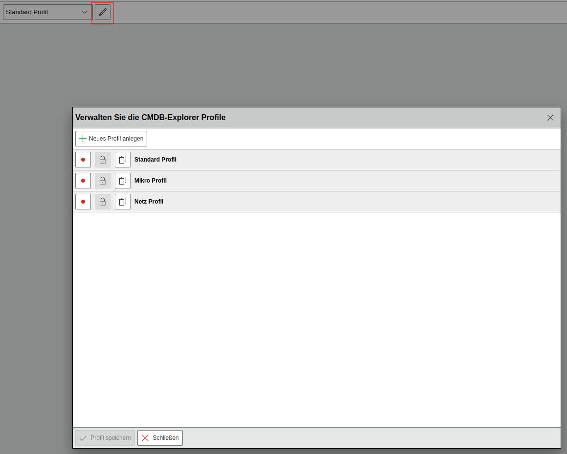
i-doit already comes with preconfigured profiles. These cannot be directly edited afterward, but can be copied and then edited.
- default Profile: All relationships are visualized. No filtering takes place. Various information is displayed for each object.
- Micro Profile: The display is reduced to the object type icons.
- Net Profile: This profile is used for the graph view and is therefore not available for the tree view.
Creating and Editing a Profile#
Via the pencil icon next to the selection field of the active profile in the toolbar, existing profiles can be edited or copied and new profiles can be added. The button in front of each profile allows you to set the profile as default, so that its settings are used directly when opening an object in the CMDB Explorer. A green dot indicates that the profile is the activated default profile.
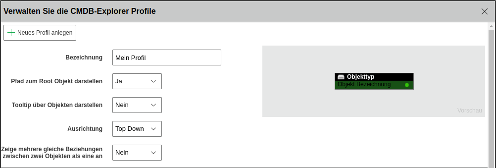
In the editing view, general settings are defined in the upper area. The view is opened by clicking the pencil icon in the row of the desired profile. In addition to the title of the profile, you can define whether the path display to the root object is enabled, whether the tooltip should be displayed, and which orientation is used. Also whether multiple identical relationships should be displayed as one. A preview of the configuration is shown to the right of the general settings.
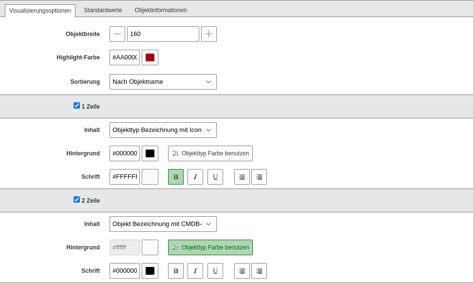
In the Visualization options tab, the graphical representation of the tiles is defined. In addition to the width, the highlight color is specified. The checkboxes activate the rows to be used. Each object can have up to eight rows. The configuration in each row is identical. The content of the row is selected in the drop-down menu. Predefined attributes are available for selection. The background can either correspond to the object color, making it dependent on the object type, or use a custom color. The font color and formatting can also be defined. Formatting options are set via the buttons.
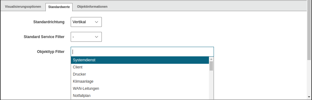
The Default values tab allows you to define values that can also be adjusted during use. Here you can specify the orientation, set the default service filter, and define the object type filter. The object type filter restricts the view to the selected object types.
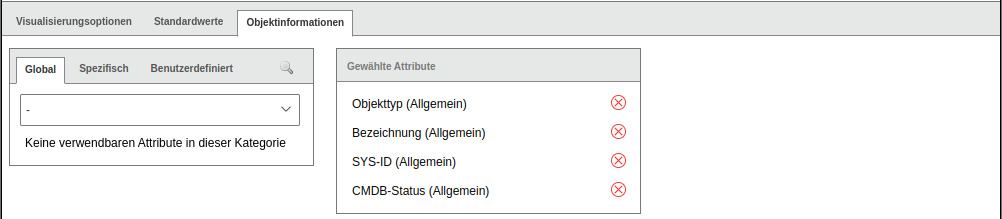
In the Object information tab, the object information to be displayed in the information area when an object is activated is selected. The selection is made via the category in the drop-down menu and then via the plus icon next to the desired attribute to be displayed. Selected attributes can be removed in the selected attributes column via the X icon.