Profiles in the CMDB-Explorer#
In order to customize the view, profiles can be created in the CMDB-Explorer, which offer the best possible overview of the dependencies in your IT documentation.
Preconfigured profiles#
i-doit provides preconfigured profiles. These cannot directly be edited, but copies can be made and edited.
- Standard profile: All relationships are visualized. No filter is applied. Various pieces of information are displayed for each object.
- Micro profile: The representation is reduced to object type icons.
- Network profile: This profile is used for the diagram view and is therefore not available for the tree view.
Creating and Editing a Profile#
Existing profiles can be edited or copied and new profiles can be added via the pencil icon next to the selection field of the active profile in the toolbar. The button next to each profile lets you set that profile as default, so its settings are immediately used when opening an object in the CMDB-Explorer. A green dot indicates that the profile is the activated default profile.
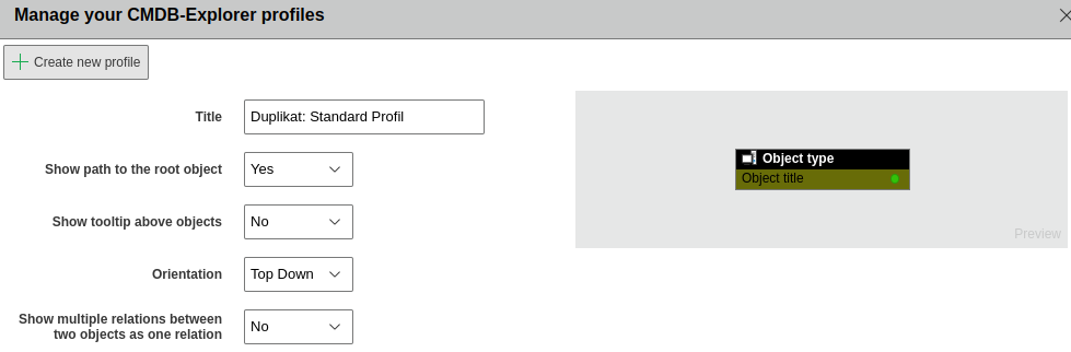
General settings are set in the upper area of the edit view. This view is opened via a click on the pencil icon in the line of the desired profile. Next to the title of the profile you can determine whether the representation of the path to the root object will be activated, whether the tooltip is to be displayed and what orientation will be used. A preview of the configuration is shown on the right side of the general settings.
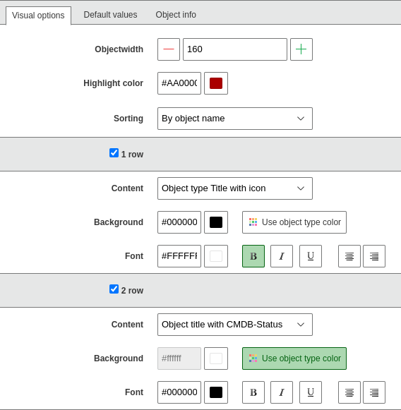
The graphical representation of the tiles is defined in the Visual options tab. The highlight color and the width are set there. The lines to be used are activated by ticking the checkboxes. Each object can have up to eight lines. The configuration is identical in each line. The content of the line is selected in the drop-down menu. Here some predefined attributes are available for selection. The background can either match the object color so that it is independent from the object type or you can use a custom-defined color. You can determine the font color as well as the character formatting. The formatting options are defined via the buttons.
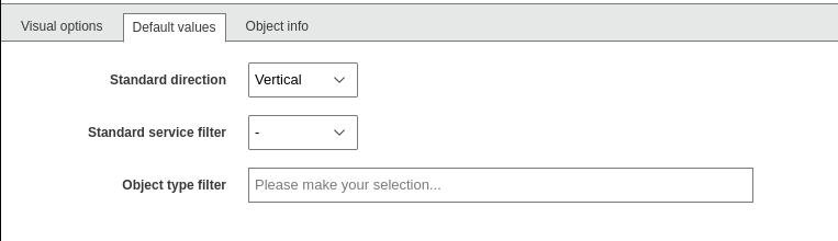
The Default values tab allows you to set values which can also be adjusted during application. Here you can set the direction and the standard service filter as well as define the object type filter. The object type filter limits the view to the selected object types.
The object information, which is displayed in the information area upon activating an object, is selected in the Object information tab. The selection is done via the category in the drop down menu and then using the plus icon next to the desired attribute you want to display. Selected attributes can be removed again using the minus icon in the Selected attributes column.