Using Forms#
Accessing the add-on#
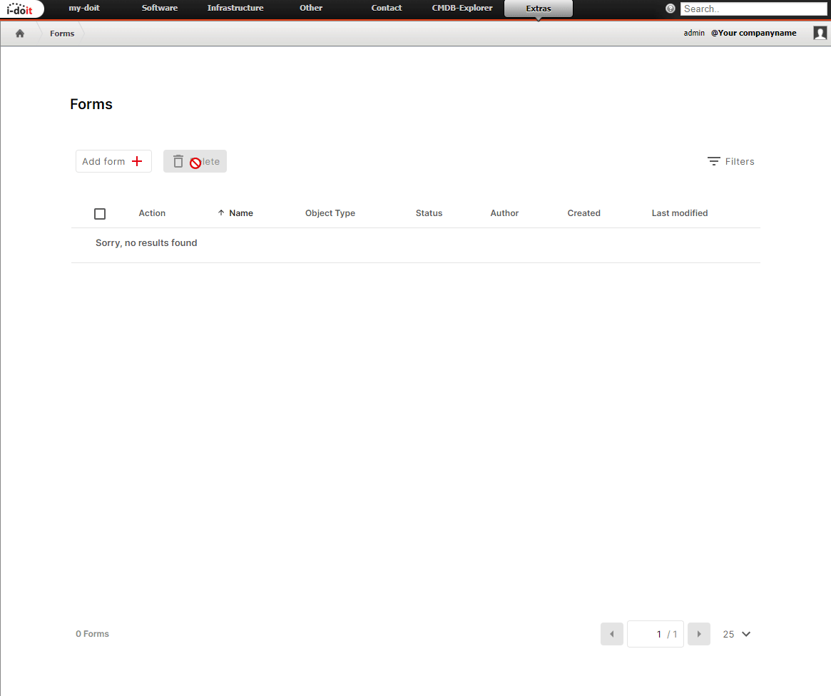
After all preparations are complete, you can access the add-on via the menu Add-ons > Forms.
Creating forms#
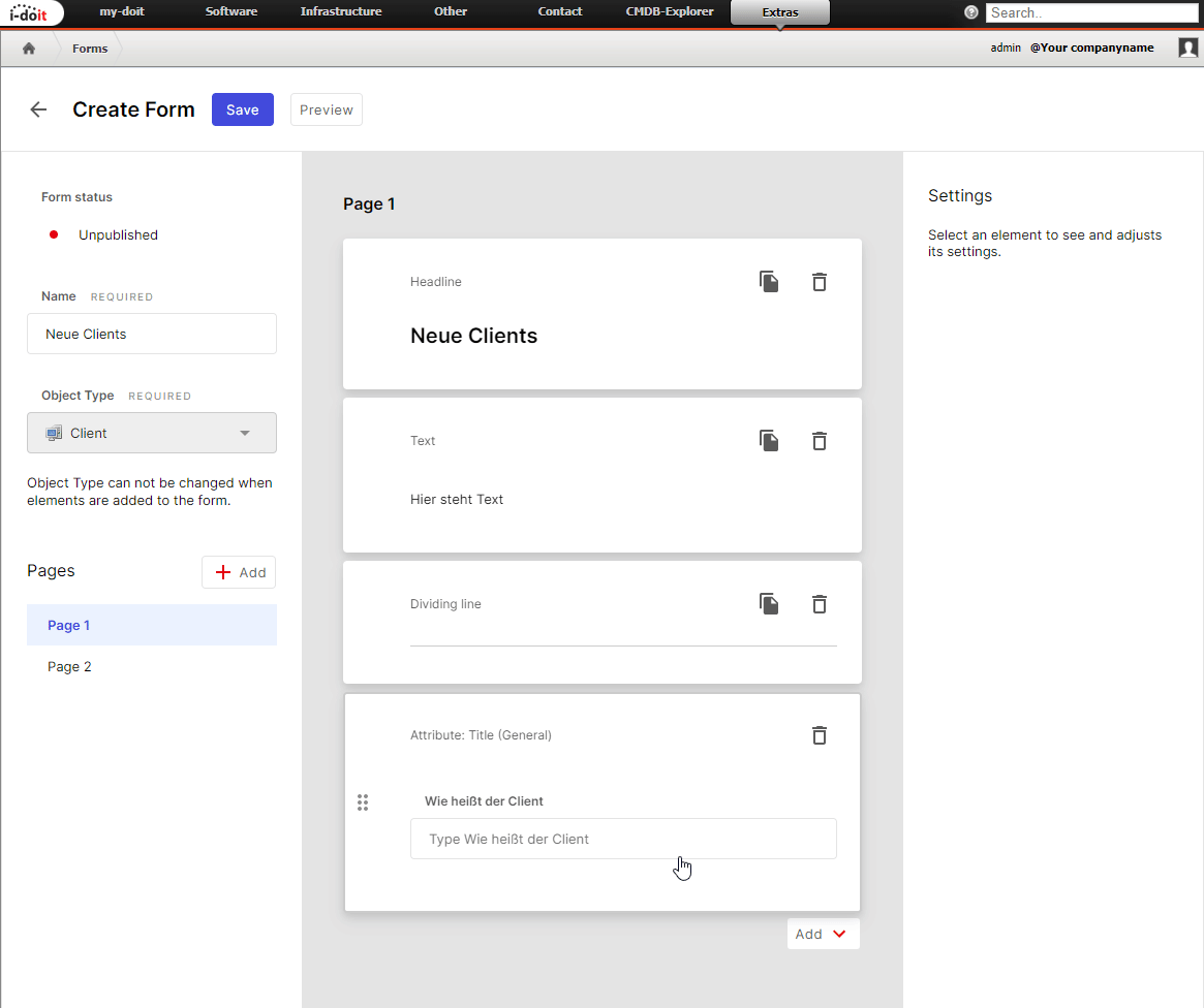
You create a form via the Add form button. First you assign the form title, then you select the object type that will be created by the form or by the user's input. After that, you add elements that should be displayed in the form: Attributes, Headlines, Texts, and Dividing Lines.
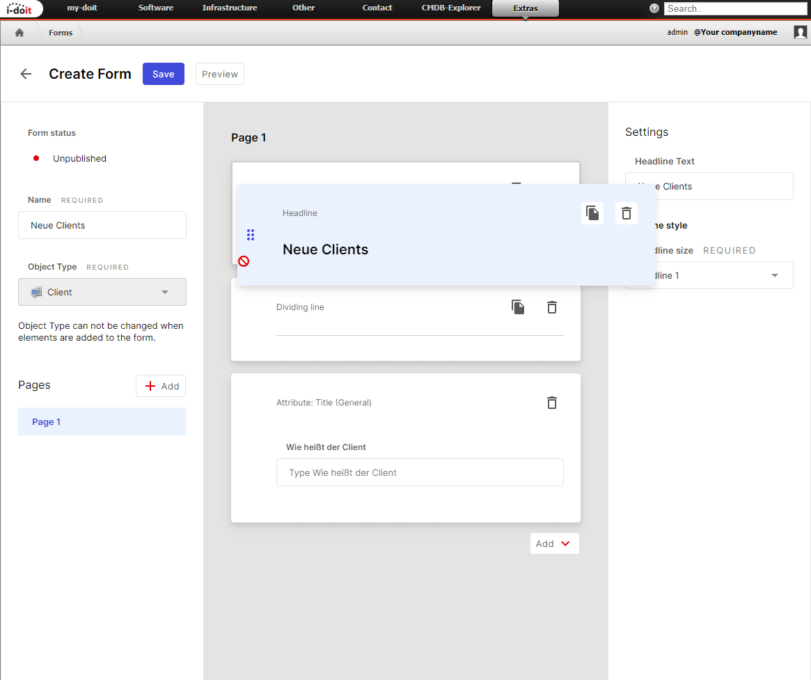
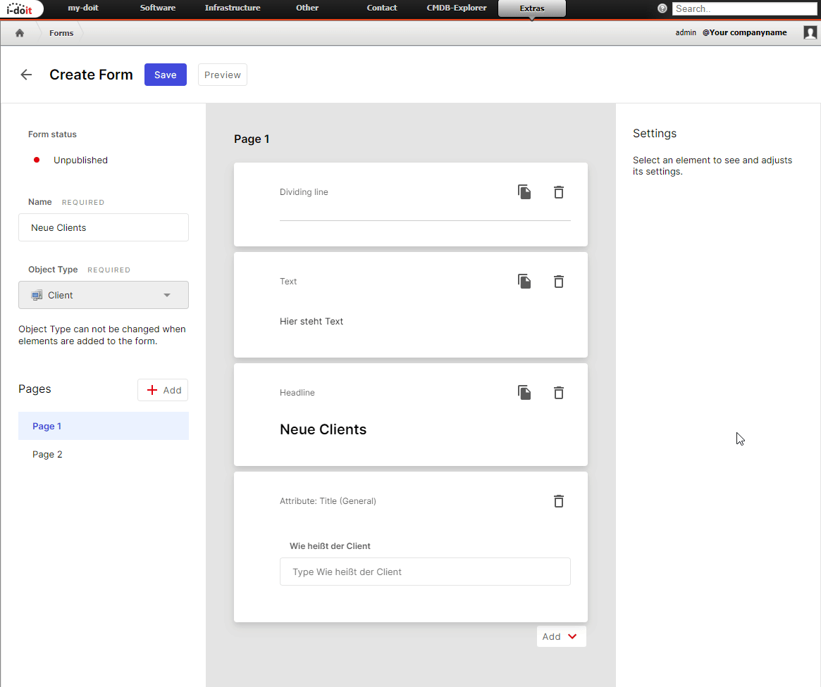
You can change the order of elements later via Drag & Drop.
Already created elements can be deleted or duplicated. You can also distribute the form across multiple pages (Pages). Pages can be moved and deleted just like the other elements.
Available Elements#
Headline (Heading)#
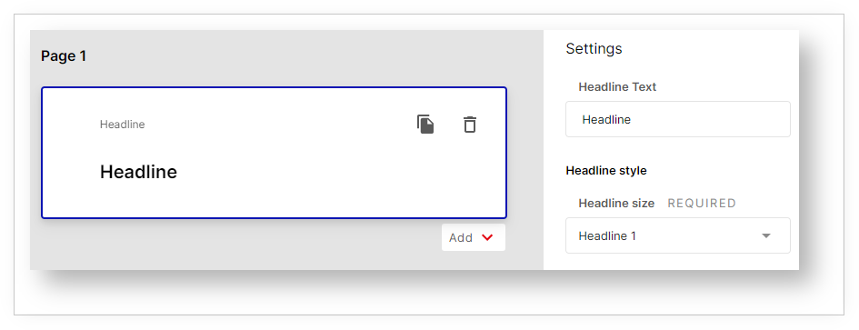
For the heading you select the style (Headline style) H1, H2 or H3.
Text#
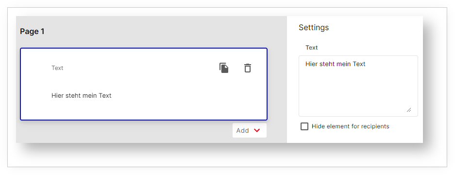
In the text element you enter a text. Optionally you can hide the element from users.
Dividing Line#
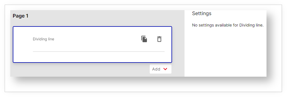
A dividing line is displayed here.
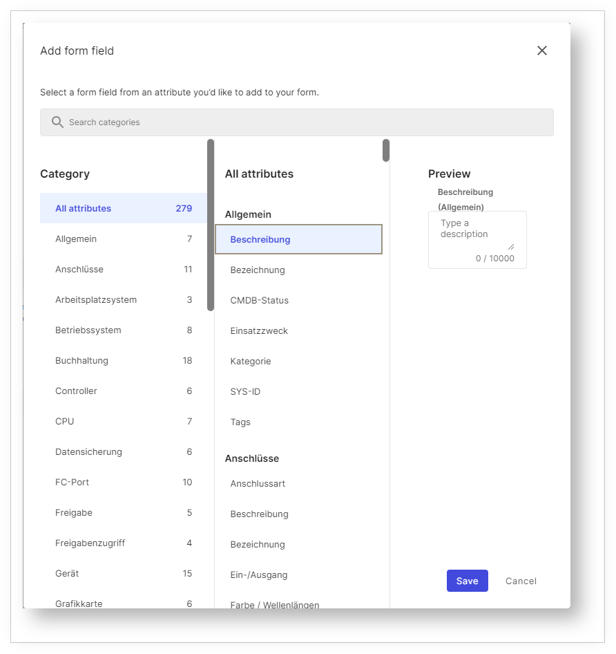
Attribute#
When adding such an element, the attribute selection opens directly. Here all categories are displayed that are assigned to the object type in i-doit.
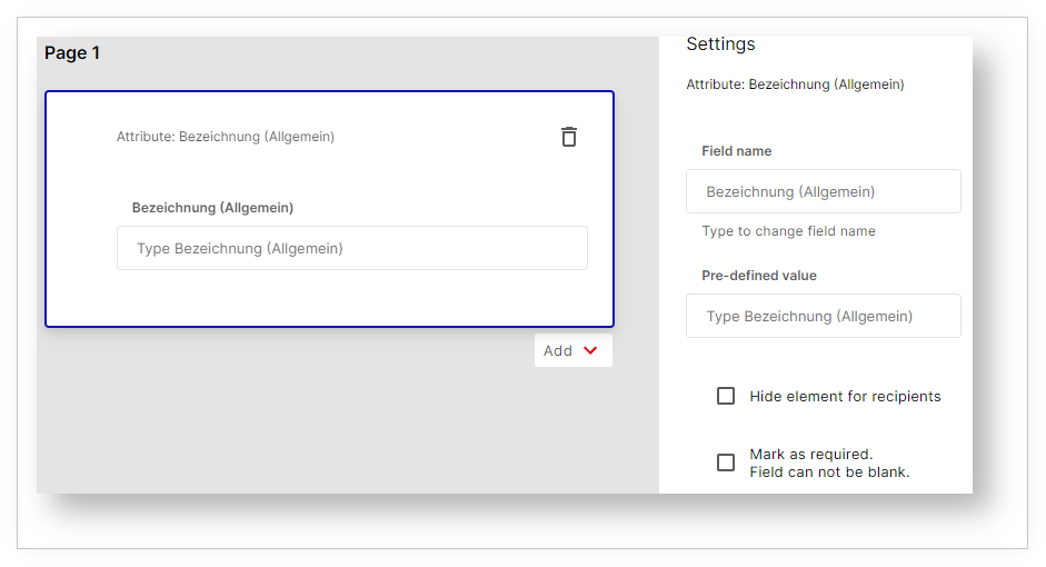
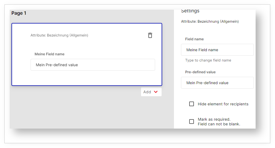
For the element you can change the Field name. Furthermore, you can set a Pre-defined value that will be pre-filled.
The setting Hide element for recipients hides fields from users. This way the form applies Pre-defined values defined by the creator to the object being created.
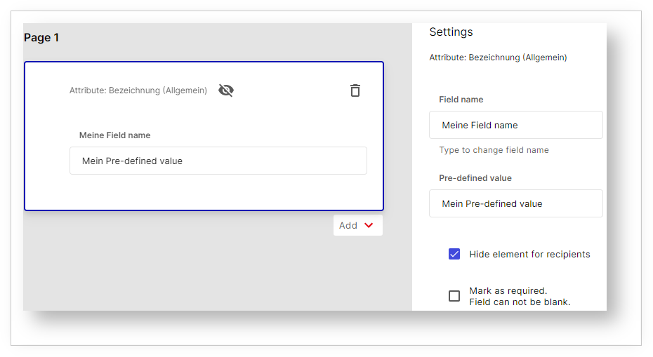
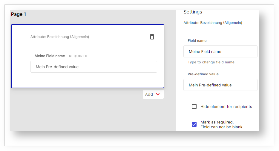
An enabled setting is recognizable by the crossed-out eye icon. Additionally, you can mark elements as Mark as required -- Field can not be blank. These attributes must then not be left empty, which is indicated by the label REQUIRED.
Preview#
Before you share the form with users, you can view it in the Preview. Click the Preview button to do so.