Use Forms#
Opening the add-on#
After all preparations are completed, the add-on can be accessed via Add-ons → Forms.
Create forms#
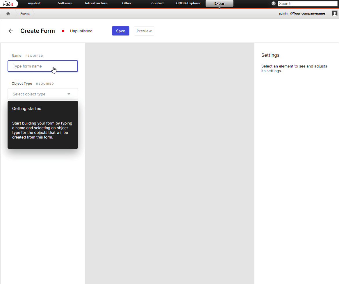
A form is created via the Create forms button. The process begins with the assignment of the form title. Then an object type is selected that is created by the form respectively by the user's input. Now we can add elements to be displayed in the form. Possible elements are attributes, headlines, texts and dividing lines.
The order of the elements can be changed afterwards, via drag&drop.
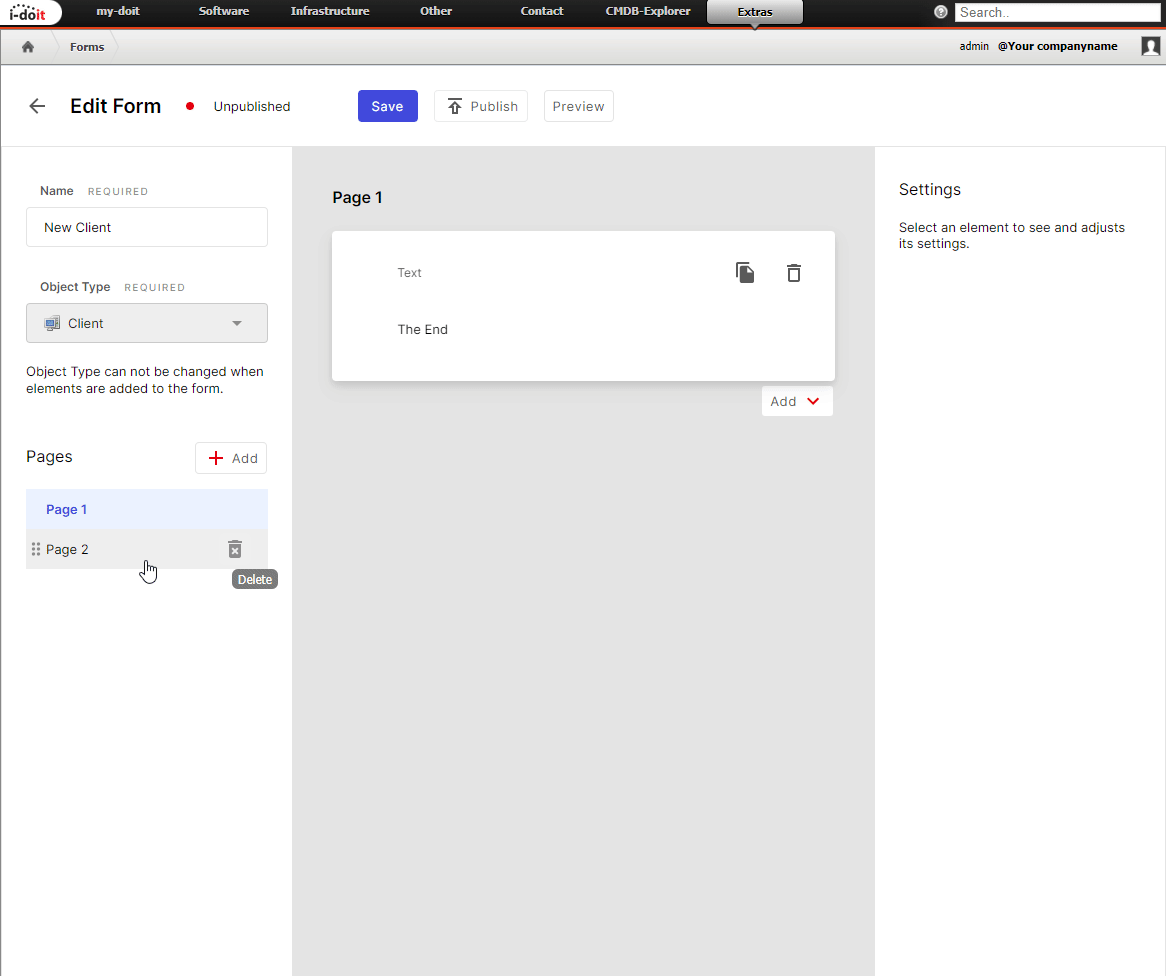
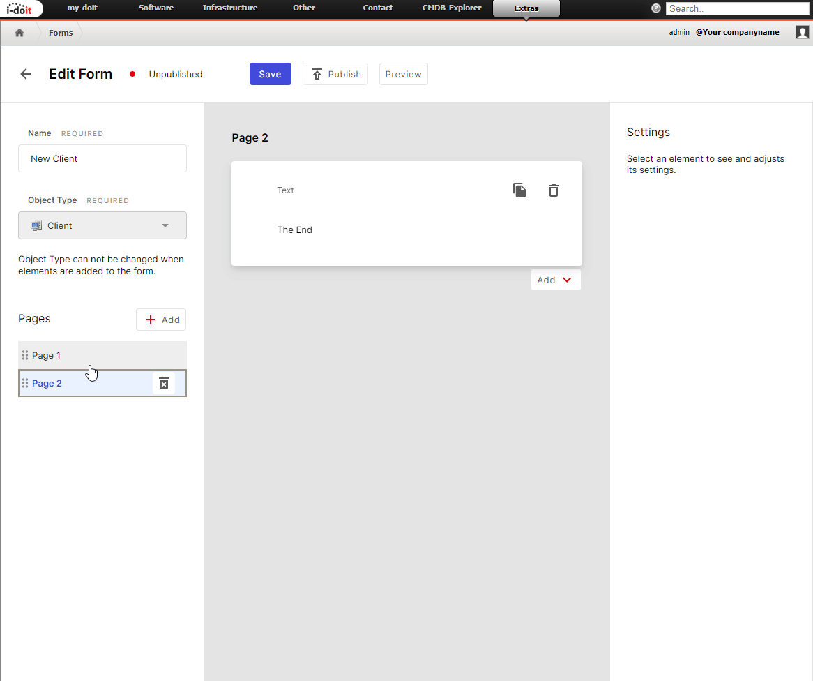
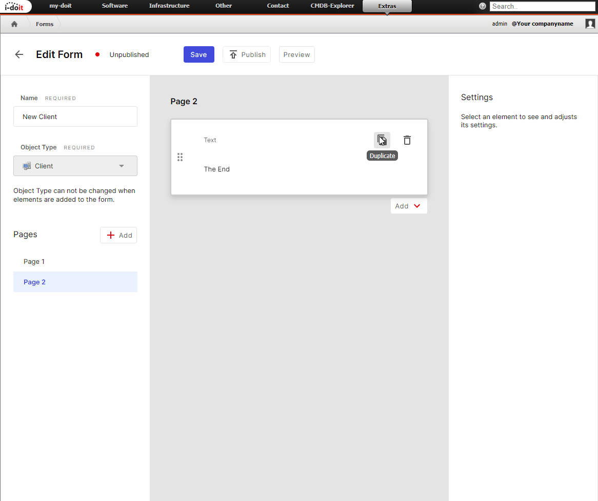
Elements that have already been created can be deleted or duplicated. Of course, you can also distribute the form over several Pages. The pages can be moved and deleted in the same way as the other elements.
Available elements#
Headline#
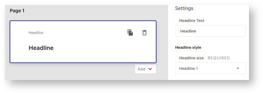
The headline style can be H1, H2 or H3.
Text#
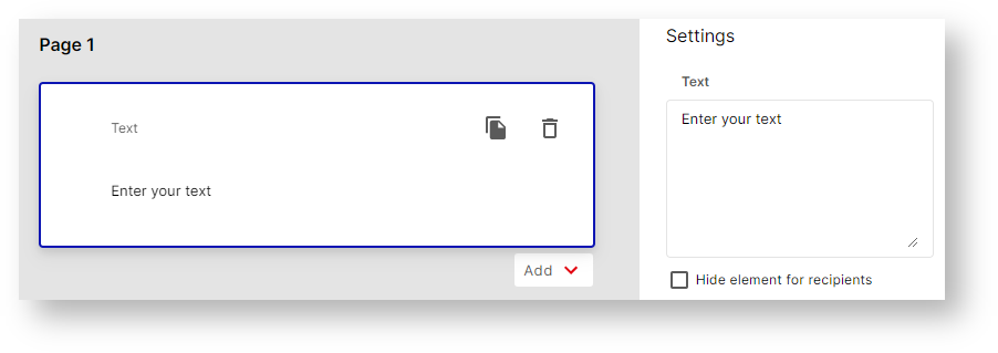
A text can be entered for the text element. There is an option to hide the element for users.
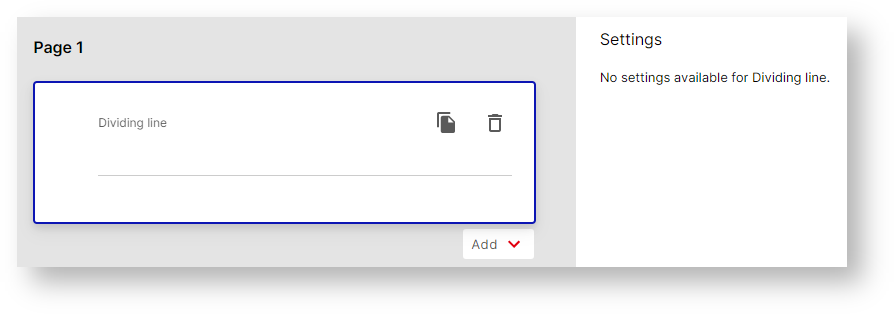
Dividing Line
Attribute#
If such an element is added, the attribute selection opens directly. Here, all categories are displayed that are assigned to the object type in i-doit.
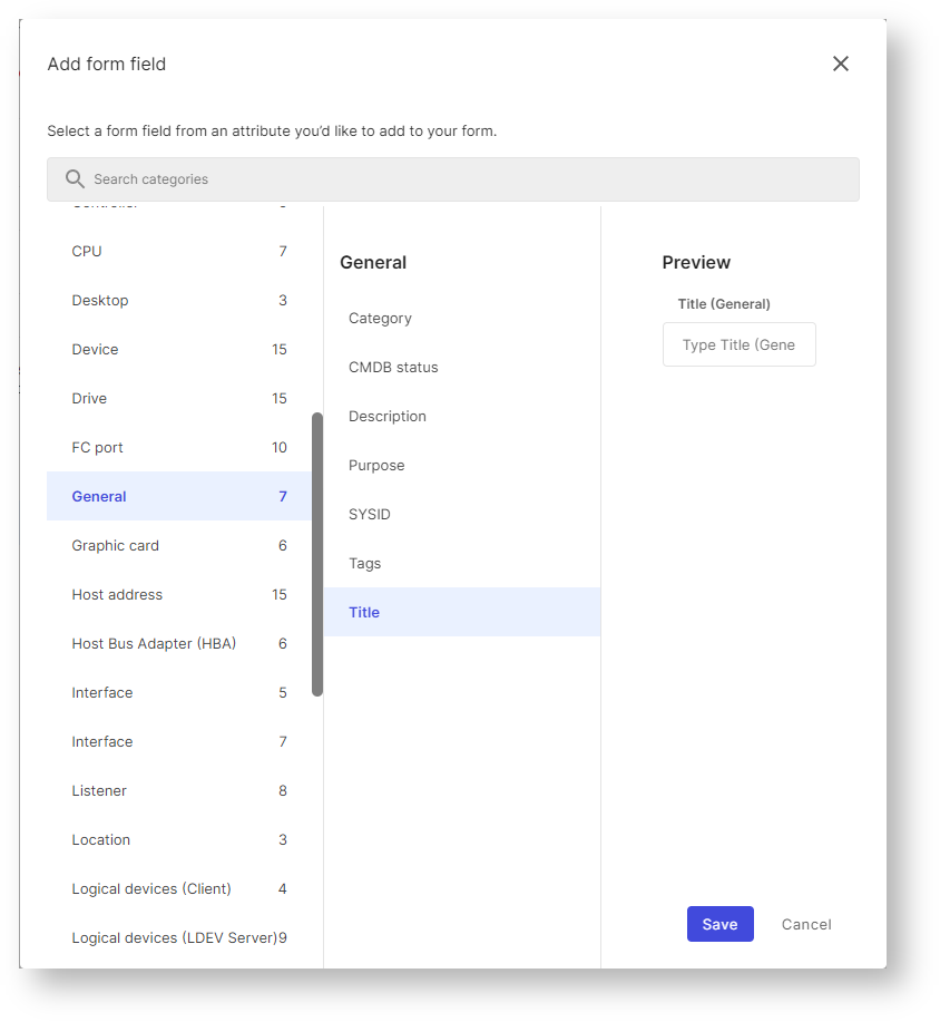
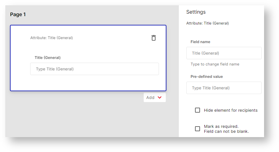
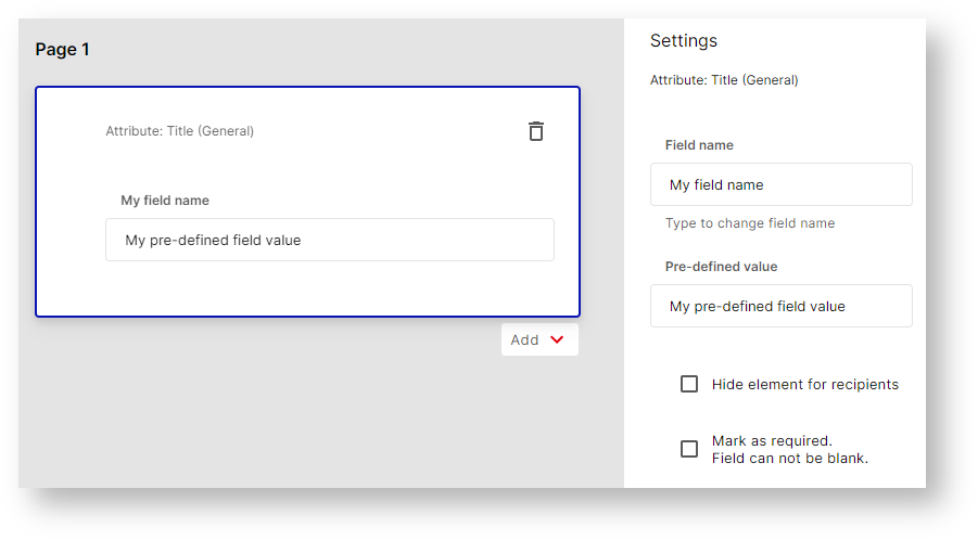
The Field name can be changed for the element. In addition, a Pre-defined value can be stored, this value is then pre-filled.
The Hide element for recipients setting is used to hide fields for users. This allows the form to include values Pre-defined values defined by the creator in the object to be created.
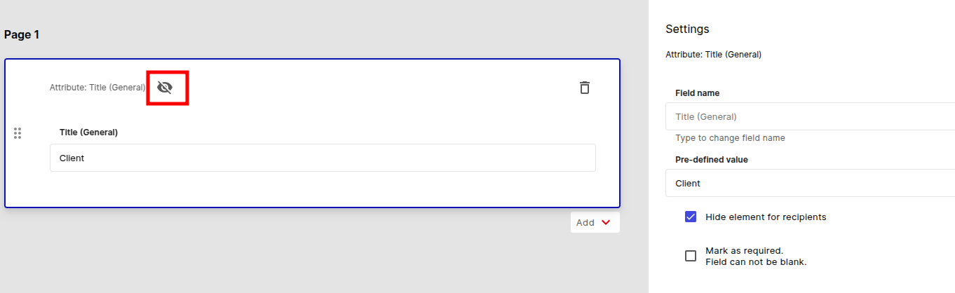
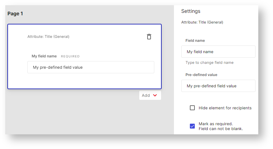
If the setting is activated, this is visualized by a crossed-out eye. In addition, these elements can be marked as Mark as required Field can not be blank. These attribute elements must then not be blank. This is indicated by the lettering Required.
Preview#
Before you release the form to the user, you naturally want to take a look at it. This is exactly why we have built in the Preview! Click the Preview button to open it.